Table of Contents
Introduction
In digital advertising, a landing page is an objective web page designed to generate leads or conversions. You land on a landing page after clicking a link in an ad. Once there, you’ll be presented with a call-to-action (CTA) asking you to buy something or sign up for something. Landing page for a store’s PPC
There are two main kinds of landing pages:
- Lead generation pages: Lead generation pages encourage users to sign up for something like a newsletter.
They typically use a form to collect information such as names and email addresses.
- Landing Pages – Landing pages aim to convert users instantly, direct them to a product page, or take them straight to the shopping cart.
When can Landing Pages be used?
Now that we’ve covered the definition of the landing page let’s talk about when you should use landing pages. What marketing tactics work best with landing pages?
Below are some of the best ways to use landing pages.
1. Pay Per Click Ads

When it comes to PPC ads, landing pages are essential. When you run a PPC ad, and someone clicks on it, they are taken to a landing page. Landing pages allow you to direct users to content that is highly relevant to their query, rather than just leading them to your site’s home page.
If you run a clothing business and someone is searching for skirts, you want your landing page to focus solely on those skirts.
Also Read: What is Data Science? – A Complete guide
2. Social Media Content
Social media is another medium where you should employ a landing page strategy. For example, social media ads use landing pages to direct users to more information. These landing pages are similar to what you would use for a PPC ad. Additionally, you can use landing pages for the content you share on your social media accounts.
Every time you create a post that contains a call to action or encourages your subscribers to sign up for something, you can direct them to a dedicated landing page.
3. Blog Posts
If you have a blog on your site, you already have a great source of inbound marketing to drive people to your site. Once they are there, you can use your blog to generate leads and conversions by including CTA (call to action) buttons in your content.
By inserting a CTA into each blog post, you can provide another route to landing pages where people can become leads or sales for your business.
4. Email Marketing
Email marketing is another fantastic way to drive people to land pages. When you send an email to a potential customer, you can center it around a call to action that directs the user to a particular landing page. Once there, they can complete tasks the email prompted them to conduct.
For example, if you send an encouraging email to users to complete a purchase they left unfinished on your website, the link can take them directly to their cart, with the almost-purchased item inside.
5 Essential Elements in Landing Page Design
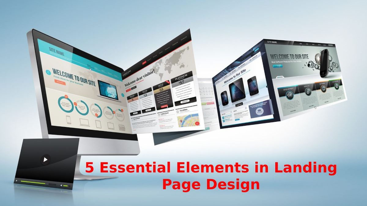
Now, let’s see the five essential elements in designing landing pages. For reference, here’s a helpful infographic showing how each aspect fits on a page. Of course, we should remember that not all landing pages will fit this mold, but this infographic gives us an excellent framework to discuss what goes into an effective landing page.
1. Content Above The Cover or “Above The Fold.”
“Above the fold” is a time online marketers stole from the newspaper industry. It refers to the first content an employer sees. For a newspaper, “Beyond the fold” is a literal term, but online marketers use it to define the content in the top 600 pixels of a landing page.
Since the first thing users see on your page, the top half of the page content is the key to attracting potential customers, so your top half of the page content should be as engaging as possible.
Main Title
A good headline is like a magnet for your potential customers. It tells them, “Yes, you’re in the correct place, and here’s what to expect…” But, your title should be more than just a general description of your page; it should pique the reader’s interest in some way.
Depending on your business, what you sell, and what you want people to do on your page, you’ll probably want to use different types of headlines. The key to text a great headline is understanding who your audience is, why they’re on your landing page, and what problem they’re hoping you can solve for them.
Also Read: What is Marketing Automation? – Benefits, Types, and More
2) Call to Action (CTA)
Although most companies place a call to action (CTA) in the top half of the page, you should designate it in its section as your CTA is what tells your visitors what action you want them to take. Therefore, before creating your CTA, you need to decide what you want people to do on your landing page.
It is essential because otherwise, you may have no CTA or several different CTAs. Having a specific offer or advantage associated with the CTA also helps drive conversions. Targeted offers make your audience feel like they’re getting something for their information and incentivize them to act now.
3) Show them the Benefits
If someone starts scrolling your landing page, you’re doing something right. Whether it’s your ad, headline, photo, or something else, the people who read your landing page are telling you, “I’m interested. Sell me why I should convert.”
The only problem is that most companies don’t know how to talk about themselves or what they sell in a way that matters to their potential customers.
Why? Well, all companies struggle with self-centeredness. After all, you use all day, every day, thinking about and improving your product or offer. So it’s natural to need to talk about all the extraordinary things that make your company unique. The only problem is that the people on your landing page don’t care.
4) Social Proof
Unfortunately, most people are instinctively wary of marketing collateral. Generally talking, most marketers tell the story that showcases their offer in the best light possible. After all, marketers make money telling people their product is excellent. Maybe your agreement is as good as you say it is, but it’s stiff to believe that someone you pay is talking about how fantastic your offer is.
On the other hand, don’t you think that an actual customer says what he feels about your product? As a result, testimonials are the easiest way to add social proof to your landing page. Unfortunately, testimonials often don’t carry much weight because they’re so easy to put together (or even manufacture).
5) Closing Argument
A good landing page should obviously lead the user to conclude that converting is in their best interest. First, however, you need to know precisely what you want them to do and why they might not want to do it.
Then throughout your landing page, address their concerns and sell them the value of what they get in exchange for the conversion. In particular, if someone makes it to the bottom of your landing page. You have one last chance to convince them to convert; here’s a good place for another CTA.
Conclusion
Landing page design is creating an enticing site page for your target audience and website visitors. It should encourage them to convert from leads into subscribers or customers.
Also Read: How does Artificial Intelligence Apply to Business Strategy?

